- Angular Tutorial
- Angular - Home
- Angular - Overview
- Angular - Features
- Angular - Advantages & Disadvantages
- Angular Basics
- Angular - Environment setup
- Angular - First Application
- Angular - MVC Architecture
- Angular Components
- Angular - Components
- Angular - Component Lifecycle
- Angular - View Encapsulation
- Angular - Component Interaction
- Angular - Component Styles
- Angular - Nested Components
- Angular - Content projection
- Angular - Dynamic components
- Angular - Elements
- Angular Templates
- Angular - Templates
- Angular - Template statements
- Angular - Template Variables
- Angular - SVG as Templates
- Angular Binding
- Angular - Data Binding
- Angular - Interpolation
- Angular - Event Binding
- Angular - Property Binding
- Angular - Attribute Binding
- Angular - Class Binding
- Angular - Style Binding
- Angular - Two-way Binding
- Angular Directives
- Angular - Directives
- Angular - Attribute Directives
- Angular - Structural Directives
- Angular - Custom Directives
- Angular Pipes
- Angular - Pipes
- Angular - Built-in Pipes
- Angular - Custom Pipes
- Angular Forms
- Angular - Forms
- Angular - Template Driven Forms
- Angular - Reactive Forms
- Angular - Form Validation
- Angular - Dynamic Forms
- Angular Dependency Injection
- Angular - Dependency Injection
- Angular - Injectable Service
- Angular Routing
- Angular - Routing
- Angular - Dynamic Routes
- Angular - Wildcard Routes
- Angular - Nested Routes
- Angular - Navigation
- Angular - Routing in SPA
- Angular - Custom Route Matches
- Angular - Router Reference
- Angular HTTP Client programming
- Angular - Services
- Angular - HTTP Client
- Angular - Request
- Angular - Response
- Angular - GET
- Angular - POST
- Angular - PUT
- Angular - DELETE
- Angular - JSONP
- Angular - CRUD Operations Using HTTP
- Angular Modules
- Angular - Introduction to Modules
- Angular - Root Module
- Angular - Feature Module
- Angular - Sharing Module
- Angular - Routing Module
- Angular - NgModules
- Angular Animation
- Angular - Animations
- Angular Service Workers & PWA
- Angular - Service Workers & PWA
- Angular Testing
- Angular - Testing Overview
- Angular Design Patterns
- Angular - Design Patterns
- Angular - Lazy Loading
- Angular - Singleton Pattern
- Angular - Observer Pattern
- Angular Libraries
- Angular - Libraries
- Angular - Angular Material
- Angular - PrimeNG
- Angular - RxJS
- Angular Advanced
- Angular - Signals
- Angular - Authentication & Authorization
- Angular - Internationalization
- Angular - Standalone Component
- Angular - Accessibility
- Angular - Web Workers
- Angular - Server Side Rendering
- Angular - Ivy Compiler
- Angular - Building with Bazel
- Angular - Backward Compatibility
- Angular - Reactive Programming
- Angular Tools
- Angular - CLI
- Angular Material UI Elements
- Angular - Paginator
- Angular - Datepicker
- Angular - Select Drop-down
- Angular Miscellaneous
- Angular - Third Party Controls
- Angular - Configuration
- Angular - Displaying Data
- Angular - Decorators & Metadata
- Angular - Basic Example
- Angular - Error Handling
- Angular - Testing & Building a Project
- Angular - Lifecycle Hooks
- Angular - User Input
- Angular - What's New?
- Angular Useful Resources
- Angular - Quick Guide
- Angular - Useful Resources
- Angular - Discussion
Angular - Select Dropdown
What is Select Dropdown?
A select dropdown (also called as a dropdown menu) is a user interface element that allows users to choose one option from a list of predefined options. Its usage can be seen in forms where users need to make a selection from a given set of choices.
In web applications built using frameworks like Angular, select dropdowns are widely used to select a single option from a long list of options, such as choosing a country or selecting a category. They hide the options until they are needed. They also prevent users from entering invalid data as users can make choices only from the predefined options.
When you use a select dropdown in your Angular application, it will appear as a compact box with default value. If the user clicks on it, it expands to show all available options. Each option is listed in a vertical stack, and the user can click on an option to select it. Once an option is selected, the dropdown collapses back to its compact form and displays the chosen option.
Creating Select Dropdown in Angular
For creating a select dropdown, we are going to use Angular Material. It is a UI component library developed by Google that follows the principles of Material Design. It provides a rich set of reusable UI components such as buttons, forms, and dialog boxes. With minimal code, you can add these ready-to-use components to your application.
To use the select dropdown component in an Angular application, follow the steps given below −
- First, import the MatSelectModule and MatFormFieldModule.
- Then, add the <mat-form-field> and <mat-select> elements to the template. This mat-select component provides a dropdown menu with a list of options. Use the two-way data binding to bind the selected value to a property in the component class.
Example
In this example, we will show how to use select dropdown in an Angular application.
Step 1: Create a new Angular project. Give name of your choice, we are naming it dropdown-app.
ng new dropdown-app
Step 2: Now, navigate to the newly created app using the below command −
cd dropdown-app
Step 3: Use the command given below to add Angular Material to your dropdown-app application −
ng add @angular/material
While adding the Angular Material, the CLI will different configuration. Choose the default options for each configuration.
Step 4: Open app.component.html and add the code given below −
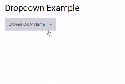
<div> <h3> {{title}} </h3> <mat-form-field appearance="fill"> <mat-label>Choose Color Name</mat-label> <mat-select [(value)]="selectedValue"> <mat-option *ngFor="let option of options" [value]="option.value"> {{ option.viewValue }} </mat-option> </mat-select> </mat-form-field> </div> <router-outlet /> Step 5: Open app.component.ts and add the following code −
import { Component } from '@angular/core'; import { RouterOutlet } from '@angular/router'; import {FormsModule} from '@angular/forms'; import {MatInputModule} from '@angular/material/input'; import {MatSelectModule} from '@angular/material/select'; import {MatFormFieldModule} from '@angular/material/form-field'; import { CommonModule } from '@angular/common'; @Component({ selector: 'app-root', standalone: true, imports: [RouterOutlet, MatFormFieldModule, MatSelectModule, MatInputModule, FormsModule, CommonModule], templateUrl: './app.component.html', styleUrl: './app.component.css' }) export class AppComponent { title = 'Dropdown Example'; selectedValue: string = ""; options = [ { value: 'option1', viewValue: 'Red' }, { value: 'option2', viewValue: 'Saffron' }, { value: 'option3', viewValue: 'Violet' }, { value: 'option4', viewValue: 'Gray' } ]; } Step 6: Open app.component.css and add some margin to the component so that it looks good −
div{ margin-top: 25px; margin-left: 25px; } Step 7: Finally, run the application using the below command −
ng serve
On running, following output will be displayed on the screen −