- Angular Tutorial
- Angular - Home
- Angular - Overview
- Angular - Features
- Angular - Advantages & Disadvantages
- Angular Basics
- Angular - Environment setup
- Angular - First Application
- Angular - MVC Architecture
- Angular Components
- Angular - Components
- Angular - Component Lifecycle
- Angular - View Encapsulation
- Angular - Component Interaction
- Angular - Component Styles
- Angular - Nested Components
- Angular - Content projection
- Angular - Dynamic components
- Angular - Elements
- Angular Templates
- Angular - Templates
- Angular - Template statements
- Angular - Template Variables
- Angular - SVG as Templates
- Angular Binding
- Angular - Data Binding
- Angular - Interpolation
- Angular - Event Binding
- Angular - Property Binding
- Angular - Attribute Binding
- Angular - Class Binding
- Angular - Style Binding
- Angular - Two-way Binding
- Angular Directives
- Angular - Directives
- Angular - Attribute Directives
- Angular - Structural Directives
- Angular - Custom Directives
- Angular Pipes
- Angular - Pipes
- Angular - Built-in Pipes
- Angular - Custom Pipes
- Angular Forms
- Angular - Forms
- Angular - Template Driven Forms
- Angular - Reactive Forms
- Angular - Form Validation
- Angular - Dynamic Forms
- Angular Dependency Injection
- Angular - Dependency Injection
- Angular - Injectable Service
- Angular Routing
- Angular - Routing
- Angular - Dynamic Routes
- Angular - Wildcard Routes
- Angular - Nested Routes
- Angular - Navigation
- Angular - Routing in SPA
- Angular - Custom Route Matches
- Angular - Router Reference
- Angular HTTP Client programming
- Angular - Services
- Angular - HTTP Client
- Angular - Request
- Angular - Response
- Angular - GET
- Angular - POST
- Angular - PUT
- Angular - DELETE
- Angular - JSONP
- Angular - CRUD Operations Using HTTP
- Angular Modules
- Angular - Introduction to Modules
- Angular - Root Module
- Angular - Feature Module
- Angular - Sharing Module
- Angular - Routing Module
- Angular - NgModules
- Angular Animation
- Angular - Animations
- Angular Service Workers & PWA
- Angular - Service Workers & PWA
- Angular Testing
- Angular - Testing Overview
- Angular Design Patterns
- Angular - Design Patterns
- Angular - Lazy Loading
- Angular - Singleton Pattern
- Angular - Observer Pattern
- Angular Libraries
- Angular - Libraries
- Angular - Angular Material
- Angular - PrimeNG
- Angular - RxJS
- Angular Advanced
- Angular - Signals
- Angular - Authentication & Authorization
- Angular - Internationalization
- Angular - Standalone Component
- Angular - Accessibility
- Angular - Web Workers
- Angular - Server Side Rendering
- Angular - Ivy Compiler
- Angular - Building with Bazel
- Angular - Backward Compatibility
- Angular - Reactive Programming
- Angular Tools
- Angular - CLI
- Angular Material UI Elements
- Angular - Paginator
- Angular - Datepicker
- Angular - Select Drop-down
- Angular Miscellaneous
- Angular - Third Party Controls
- Angular - Configuration
- Angular - Displaying Data
- Angular - Decorators & Metadata
- Angular - Basic Example
- Angular - Error Handling
- Angular - Testing & Building a Project
- Angular - Lifecycle Hooks
- Angular - User Input
- Angular - What's New?
- Angular Useful Resources
- Angular - Quick Guide
- Angular - Useful Resources
- Angular - Discussion
Angular - Attribute Binding
What is Attribute Binding?
Attribute binding helps to set the value for the attribute of the HTML element. Angular exposes attributes of the HTML element with a matching property with the attribute name converted into camelCase.
For example, the colspan attribute's corresponding angular property is colSpan. Even though, angular tries to provide all HTML elements attributes as property, it still misses some of the attributes of SVG elements, aria (web accessibility) elements, etc.,
We can use attribute binding where the attributes of a HTML element is not available as property. Also, we can use attribute binding for attributes of all HTML element.
How to use Attribute Binding?
To use attribute binding in your Angular application, use the square brackets around the attribute name. It basically represents the attribute of a HTML element in the template.
Syntax
The syntax to use attribute binding is as follows −
<HTMLTag [attr.<attribute_name>]="<template variable>" />
We can combine attr. string with the actual attribute name of the HTML element to create the angular attribute representation. The value of the attribute is a template variable. While generating the view from the template, angular will set the value of the attribute by processing the template variable.
Implementing Attribute Binding
Let us create a simple registration form to understand attribute binding. Our registration form will have three input field as shown below and a button to submit the registration form.
- Username
- Password
- Confirm password
Step 1: Create a new application, my-app using angular CLI as shown below −
ng new my-app
Step 2: Create a new registration form component, RegisterForm using angular CLI as shown below −
ng generate component RegisterForm
Step 3: Open the registration form component's template and add user registration form with username, password and confirm password.
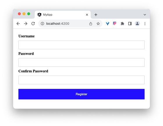
<div> <form method="post"> <div class="container"> <label for="username"><b>Username</b></label> <input type="text" name="username" required> <label for="password"><b>Password</b></label> <input type="password" name="password" required> <label for="confirm_password"><b>Confirm Password</b></label> <input type="password" name="confirm_password" required> <button type="submit">Register</button> </div> </form> </div>
Step 4: Open the registration form component's style and style the registration form using CSS as shown below −
.container { padding: 15px; } input[type=text], input[type=password] { width: 100%; padding: 10px 20px; margin: 10px 0; display: inline-block; border: 1px solid #ccc; box-sizing: border-box; } button { background-color: blue; color: white; padding: 15px 20px; margin: 10px 0; border: none; cursor: pointer; width: 100%; } Step 5: Include our registration form component in the app template file, app.component.html:
<app-register-form />
Step 6: Run the application and test the registration form.
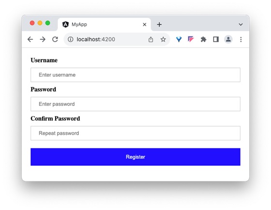
Step 7: Next, we will try to set the placeholder text for all input field using attributes binding. Add three member variable in the component to represent the placeholder text for username, password and confirm password input field.
placeholder1: string = "Enter username" placeholder2: string = "Enter password" placeholder3: string = "Repeat password"
Step 8: Assign the above declared component's member variable to the placeholder attributes of username, password and confirm password input accordingly in the template using [attr.placeholder] attribute as shown below −
<div> <form method="post"> <div class="container"> <label for="username"><b>Username</b></label> <input type="text" [attr.placeholder]="placeholder1" name="username" required> <label for="password"><b>Password</b></label> <input type="password" [attr.placeholder]="placeholder2" name="password" required> <label for="confirm_password"><b>Confirm Password</b></label> <input type="password" [attr.placeholder]="placeholder3" name="confirm_password" required> <button type="submit">Register</button> </div> </form> </div>
Here,
attr.placeholder represents the placeholder attribute of input elements.
Step 9: Let us add ARIA attribute, aria-label to the input field. aria-label is used for accessibility purposes.
<div> <form method="post"> <div class="container"> <label for="username"><b>Username</b></label> <input type="text" [attr.aria-label]="placeholder1" [attr.placeholder]="placeholder1" name="username" required> <label for="password"><b>Password</b></label> <input type="password" [attr.aria-label]="placeholder2" [attr.placeholder]="placeholder2" name="password" required> <label for="confirm_password"><b>Confirm Password</b></label> <input type="password" [attr.aria-label]="placeholder3" [attr.placeholder]="placeholder3" name="confirm_password" required> <button type="submit">Register</button> </div> </form> </div>
Step 10: Next, run the application and check the output.

Step 11: Since, we can set any attribute of the HTML element using attribute binding, let us apply the class, container using attribute binding.
Step 12: Create a new member variable, myContainerClass in the component as shown below −
myContainerClass: string = "container"
Step 13: Apply the member variable in the template as shown below −
<div [attr.class]="myContainerClass"> <!-- form --> </div>
Step 14: The complete listing of the component is as follows:
import { Component } from '@angular/core'; @Component({ selector: 'app-login-form', templateUrl: './register-form.component.html', styleUrls: ['./register-form.component.css'] }) export class RegisterFormComponent { myContainerClass: string = "container" placeholder1: string = "Enter username" placeholder2: string = "Enter password" placeholder3: string = "Repeat password" } Step 15: The complete listing of the component's template is as follows:
<div> <form method="post"> <div class="container"> <label for="username"><b>Username</b></label> <input type="text" [attr.aria-label]="placeholder1" [attr.placeholder]="placeholder1" name="username" required> <label for="password"><b>Password</b></label> <input type="password" [attr.aria-label]="placeholder2" [attr.placeholder]="placeholder2" name="password" required> <label for="confirm_password"><b>Confirm Password</b></label> <input type="password" [attr.aria-label]="placeholder3" [attr.placeholder]="placeholder3" name="confirm_password" required> <button type="submit">Register</button> </div> </form> </div>
Step 16: Next, run the application and check the output.
Differences between Property Binding and Attribute Binding
The table below shows how property binding is different from attribute binding −
| Property Binding | Attribute Binding |
|---|---|
Property Binding binds to the properties of DOM elements or directives. | Attribute binding binds to the attributes of an element |
It is used to bind properties that can change dynamically, like DOM properties. | It is used when you need to bind to attributes that do not have corresponding properties on the element. |
It directly updates the DOM property. | It updates the attribute value, but does not directly affect the DOM property. |
Conclusion
Attribute binding enables the developer to set dynamic value for attribute of the any HTML element, even for element, which may be defined in the future.