- Python Pandas - Home
- Python Pandas - Introduction
- Python Pandas - Environment Setup
- Python Pandas - Basics
- Python Pandas - Introduction to Data Structures
- Python Pandas - Index Objects
- Python Pandas - Panel
- Python Pandas - Basic Functionality
- Python Pandas - Indexing & Selecting Data
- Python Pandas - Series
- Python Pandas - Series
- Python Pandas - Slicing a Series Object
- Python Pandas - Attributes of a Series Object
- Python Pandas - Arithmetic Operations on Series Object
- Python Pandas - Converting Series to Other Objects
- Python Pandas - DataFrame
- Python Pandas - DataFrame
- Python Pandas - Accessing DataFrame
- Python Pandas - Slicing a DataFrame Object
- Python Pandas - Modifying DataFrame
- Python Pandas - Removing Rows from a DataFrame
- Python Pandas - Arithmetic Operations on DataFrame
- Python Pandas - IO Tools
- Python Pandas - IO Tools
- Python Pandas - Working with CSV Format
- Python Pandas - Reading & Writing JSON Files
- Python Pandas - Reading Data from an Excel File
- Python Pandas - Writing Data to Excel Files
- Python Pandas - Working with HTML Data
- Python Pandas - Clipboard
- Python Pandas - Working with HDF5 Format
- Python Pandas - Comparison with SQL
- Python Pandas - Data Handling
- Python Pandas - Sorting
- Python Pandas - Reindexing
- Python Pandas - Iteration
- Python Pandas - Concatenation
- Python Pandas - Statistical Functions
- Python Pandas - Descriptive Statistics
- Python Pandas - Working with Text Data
- Python Pandas - Function Application
- Python Pandas - Options & Customization
- Python Pandas - Window Functions
- Python Pandas - Aggregations
- Python Pandas - Merging/Joining
- Python Pandas - MultiIndex
- Python Pandas - Basics of MultiIndex
- Python Pandas - Indexing with MultiIndex
- Python Pandas - Advanced Reindexing with MultiIndex
- Python Pandas - Renaming MultiIndex Labels
- Python Pandas - Sorting a MultiIndex
- Python Pandas - Binary Operations
- Python Pandas - Binary Comparison Operations
- Python Pandas - Boolean Indexing
- Python Pandas - Boolean Masking
- Python Pandas - Data Reshaping & Pivoting
- Python Pandas - Pivoting
- Python Pandas - Stacking & Unstacking
- Python Pandas - Melting
- Python Pandas - Computing Dummy Variables
- Python Pandas - Categorical Data
- Python Pandas - Categorical Data
- Python Pandas - Ordering & Sorting Categorical Data
- Python Pandas - Comparing Categorical Data
- Python Pandas - Handling Missing Data
- Python Pandas - Missing Data
- Python Pandas - Filling Missing Data
- Python Pandas - Interpolation of Missing Values
- Python Pandas - Dropping Missing Data
- Python Pandas - Calculations with Missing Data
- Python Pandas - Handling Duplicates
- Python Pandas - Duplicated Data
- Python Pandas - Counting & Retrieving Unique Elements
- Python Pandas - Duplicated Labels
- Python Pandas - Grouping & Aggregation
- Python Pandas - GroupBy
- Python Pandas - Time-series Data
- Python Pandas - Date Functionality
- Python Pandas - Timedelta
- Python Pandas - Sparse Data Structures
- Python Pandas - Sparse Data
- Python Pandas - Visualization
- Python Pandas - Visualization
- Python Pandas - Additional Concepts
- Python Pandas - Caveats & Gotchas
Python Pandas - Bar Plots
A bar plot is a graphical representation of categorical data using rectangular bars, where the length of each bar is proportional to the value it represents. Bar plots are commonly used to compare discrete categories. The bars can be displayed either vertically or horizontally −
Vertical bar plot: Categories are displayed along the x-axis, and the values are represented on the y-axis.
Horizontal bar plot: Categories are along the y-axis, and the values are represented on the x-axis.
In Pandas, the plot.bar() and plot.barh() methods allow you to create vertical and horizontal bar plots, respectively. In this tutorial, we will learn about how to use these Pandas methods for creating various types of bar plots, including stacked, grouped, bar plot customization, and more.
Bar Plots in Pandas
The Pandas library provides two efficient methods called plot.bar() and plot.barh() for creating bar plots directly from Series or DataFrame objects. These methods internally use Matplotlib and return either a matplotlib.axes.Axes object or NumPy array np.ndarray of Axes when subplots parameter is set to True.
The plot.bar() method creates the vertical bar plots, while plot.barh() creates horizontal bar plots.
Syntax
Following is the syntax of the plot.bar() Method −
DataFrame.plot.bar(x=None, y=None, **kwargs)
Following is the syntax of the plot.barh() Method −
DataFrame.plot.barh(x=None, y=None, **kwargs)
Where,
x: Specifies the column for the categorical values. If not specified, then the DataFrame index is used.
y: Specifies the column or index label for the y-axis. If not specified, all numerical columns are used.
color: Sets colors for bars. Accepts a single color, a sequence of colors, or a dictionary mapping columns to colors.
**kwargs: Additional arguments to customize the plot.
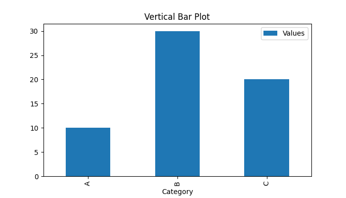
Creating a Vertical Bar Plot
You can use the DataFrame.plot.bar() method for creating the basic vertical bar plot. In this categories are displayed along the x-axis, while the heights of these bars along the y-axis represents the values.
Example
This example creates a simple vertical bar plot using the DataFrame.plot.bar() method.
import pandas as pd import numpy as np import matplotlib.pyplot as plt plt.rcParams["figure.figsize"] = [7, 4] # Create a DataFrame with sample data df = pd.DataFrame({'Category': ['A', 'B', 'C'], 'Values': [10, 30, 20]}) # Vertical bar plot ax = df.plot.bar(x='Category', y='Values') plt.title("Vertical Bar Plot") plt.show() After executing the above code, we get the following output −
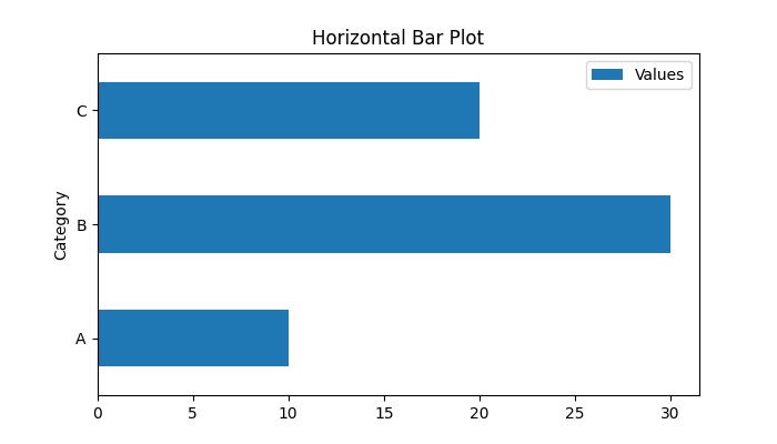
Create a Horizontal Bar plot
To create a horizontal bar chart, we can use plot.barh() method. A horizontal bar plot flips the orientation of the bars, where y-axis displays the categories, and the heights of these bars along the x-axis represents the values.
Example
The following example demonstrates how to create a horizontal bar plot using the DataFrame.plot.barh() method.
import pandas as pd import numpy as np import matplotlib.pyplot as plt plt.rcParams["figure.figsize"] = [7, 4] # Create a DataFrame with sample data df = pd.DataFrame({'Category': ['A', 'B', 'C'], 'Values': [10, 30, 20]}) # Horizontal bar plot ax = df.plot.barh(x='Category', y='Values') plt.title("Horizontal Bar Plot") plt.show() Following is the output of the above code −
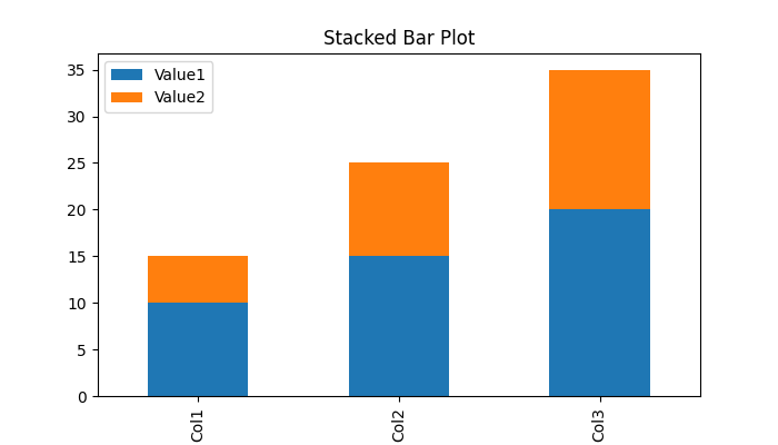
Plotting a Stacked Bar plot
Stacked bar plots display multiple numerical columns in a single bar, showing cumulative values for each category. To create stacked bars, set the Stacked parameter to True.
Example: Plotting a Stacked Vertical Bar plot
This example creates a stacked bar plot by setting the stacked parameter to True.
import pandas as pd import numpy as np import matplotlib.pyplot as plt plt.rcParams["figure.figsize"] = [7, 4] # Sample DataFrame data = {'Category': ['Col1', 'Col2', 'Col3'], 'Value1': [10, 15, 20], 'Value2': [5, 10, 15]} df = pd.DataFrame(data) # Stacked bar plot ax = df.plot.bar(x='Category', stacked=True) plt.title("Stacked Bar Plot") plt.show() On executing the above code we will get the following output −
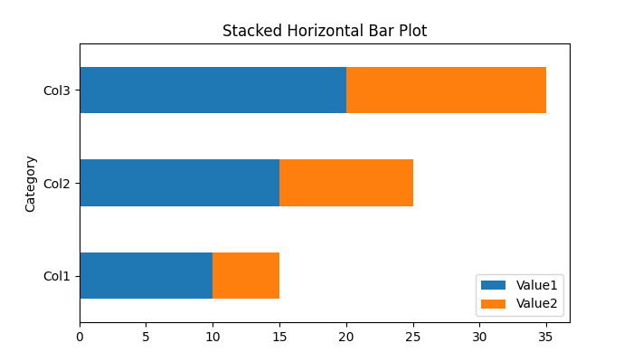
Example: Plotting a Stacked Horizontal Bar plot
This example creates a stacked horizontal bar plot by adjusting the stacked parameter value of the plot.barh() method.
import pandas as pd import numpy as np import matplotlib.pyplot as plt plt.rcParams["figure.figsize"] = [7, 4] # Sample DataFrame data = {'Category': ['Col1', 'Col2', 'Col3'], 'Value1': [10, 15, 20], 'Value2': [5, 10, 15]} df = pd.DataFrame(data) # Stacked horizontal bar plot ax = df.plot.barh(x='Category', stacked=True) plt.title("Stacked Horizontal Bar Plot") plt.show() After executing the above code, we get the following output −
Customizing Bar Plots
You can customize bar plots using the various parameters available in Matplotlib, such as colors, colormaps, labels, gridlines, and more.
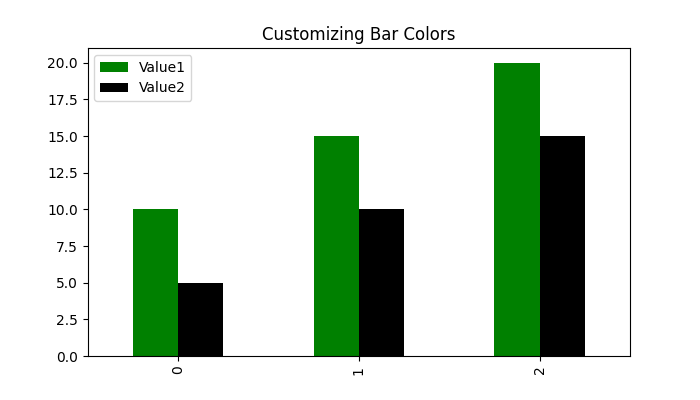
Example: Customizing Bar Colors
This example demonstrates using the Python dictionary object for mapping column names to colors customization.
import pandas as pd import numpy as np import matplotlib.pyplot as plt plt.rcParams["figure.figsize"] = [7, 4] # Sample DataFrame data = {'Category': ['Col1', 'Col2', 'Col3'], 'Value1': [10, 15, 20], 'Value2': [5, 10, 15]} df = pd.DataFrame(data) # Assign specific colors to columns ax = df.plot.bar(color={'Value1': 'green', 'Value2': 'black'}) plt.title("Customizing Bar Colors") plt.show() Following is the output of the above code −
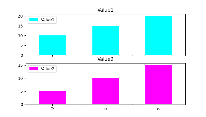
Example: Splitting Bar Plot into Subplots
You can split multiple columns of a DataFrame into separate plots using the subplots=True parameter. The following example demonstrates the same.
import pandas as pd import numpy as np import matplotlib.pyplot as plt plt.rcParams["figure.figsize"] = [7, 4] # Sample DataFrame data = {'Category': ['Col1', 'Col2', 'Col3'], 'Value1': [10, 15, 20], 'Value2': [5, 10, 15]} df = pd.DataFrame(data) # Subplots for each column axes = df.plot.bar(subplots=True, color=['cyan', 'magenta']) plt.show() On executing the above code we will get the following output −