2
$\begingroup$

I am really new to the world of matplotlib graphing as well as using those graphs to understand data.

I have written a simple python code where I read a .csv file in and then store the values of one column into a variable. Then plotting them similar to the code bellow:

dev_x= X #storing the values of the column to dev_x plt.plot(dev_x) plt.title('Data') 

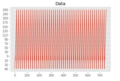
The graph looks like this, which seems quite messy and hard to understand. So, I am asking for some advice on how to make more cohesive graphs.

enter image description here

This is what my .csv column looks like. It is just many other other rows.

['40' '20' '10' '0' '10' '30' '50' '70' '90' '110' '130' '150' '170' '200' '240' '290' '40' '20' '10' '0' '10' '30' '50' '70' '90' '110' '130' '150' '170' '200' '240' '290' '40' '20' '10' '0' '10' '30' '50' '70' '90' '110' 

At the end of the day I would like a way to display these in a better way so I can also find the variance of this column.

$\endgroup$

    1 Answer 1

    2
    $\begingroup$

    You have currently stored your numbers as strings causing matplotlib to treat your variable as categorical, hence the y-axis is not ordered as expected. Before plotting you should therefore first convert them to integers like this:

    x = [float(i.replace(",", ".")) for i in dev_x] 

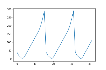
    You can then use plt.plot(x) once again to plot the values, this should give you the following plot:

    enter image description here

    Edit:

    Using the csv file you've provided, I am using the following code to read in the data and create the plot:

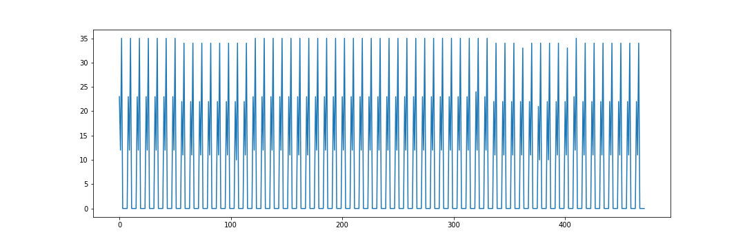
    import matplotlib.pyplot as plt import pandas as pd # Read in csv file df = pd.read_csv("DATA.csv") # Set figure size plt.figure(figsize=(15, 5)) # Create plot plt.plot(df["DATA"]) 

    This should give the following plot: enter image description here

    $\endgroup$
    10
    • $\begingroup$I have tried the following order x = [int(i) for i in dev_x] plt.plot(dev_x) unfortunately I am getting the following error ValueError: invalid literal for int() with base 10: '23,43' $\endgroup$
      – E199504
      CommentedFeb 1, 2020 at 11:12
    • $\begingroup$In your example the numbers were all integers so I assumed that was the case for the rest of the numbers you didn't include as well. See my edit above, which should work for floats with a comma as the decimal point.$\endgroup$
      – Oxbowerce
      CommentedFeb 1, 2020 at 12:15
    • $\begingroup$thank you this is where I have included your line of code x = [float(i.replace(",", ".")) for i in dev_x] plt.plot(dev_x) my graph is still looking the same . Here is a picture showing the results I am getting with your code and without Picture$\endgroup$
      – E199504
      CommentedFeb 1, 2020 at 12:36
    • $\begingroup$Can you show me the full csv file so I know what the complete data looks like?$\endgroup$
      – Oxbowerce
      CommentedFeb 1, 2020 at 12:49
    • $\begingroup$this is a link to just the column of data that I am plotting Link to file. . Keep in mind I want to be also plotting other columns for other graph that their range of numbers might be different$\endgroup$
      – E199504
      CommentedFeb 1, 2020 at 13:01

    Start asking to get answers

    Find the answer to your question by asking.

    Ask question

    Explore related questions

    See similar questions with these tags.