5
$\begingroup$

I have my dataset that has multiple features and based on that the dependent variable is defined to be 0 or 1. I want to get a scatter plot such that all my positive examples are marked with 'o' and negative ones with 'x'. I am using python and here is the code for the beginning.

import numpy as np import matplotlib.pyplot as plt import pandas as pd # Importing the dataset dataset = pd.read_csv('/home/Dittu/Desktop/Project/creditcard.csv') 

now I know how to make scatter plots for two different classes.

fig = plt.figure() ax1 = fig.add_subplot(111) ax1.scatter(x[:4], y[:4], s=10, c='b', marker="s", label='first') ax1.scatter(x[40:],y[40:], s=10, c='r', marker="o", label='second') plt.show() 

but how to segregate both class of examples and the plot them or plot them with distinct marks without separating?

$\endgroup$
4
  • $\begingroup$pass the c parameter..$\endgroup$
    – Aditya
    CommentedJun 28, 2018 at 19:42
  • 1
    $\begingroup$Can you please elaborate more? @Aditya$\endgroup$
    – Nitish
    CommentedJun 28, 2018 at 20:01
  • $\begingroup$Added an answer below, tweak it to suit your target variable, you will find it in the docs$\endgroup$
    – Aditya
    CommentedJun 28, 2018 at 20:02
  • $\begingroup$May I know what data of CSV file$\endgroup$CommentedDec 17, 2018 at 16:04

3 Answers 3

6
$\begingroup$

One approach is to plot the data as a scatter plot with a low alpha, so you can see the individual points as well as a rough measure of density.

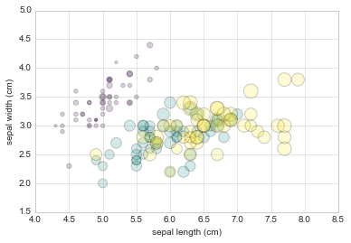
from sklearn.datasets import load_iris iris = load_iris() features = iris.data.T plt.scatter(features[0], features[1], alpha=0.2, s=100*features[3], c=iris.target, cmap='viridis') plt.xlabel(iris.feature_names[0]) plt.ylabel(iris.feature_names[1]); 

sample image

We can see that this scatter plot has given us the ability to simultaneously explore four different dimensions of the data:

  • the (x, y) location of each point corresponds to the sepal length and width,
  • the size of the point is related to the petal width, and
  • the color is related to the particular species of flower, i.e the Target Variable...

Multicolor and multifeature scatter plots like this can be useful for both exploration and presentation of data.

$\endgroup$
    4
    $\begingroup$

    Found the answer. Thank you @Aditya

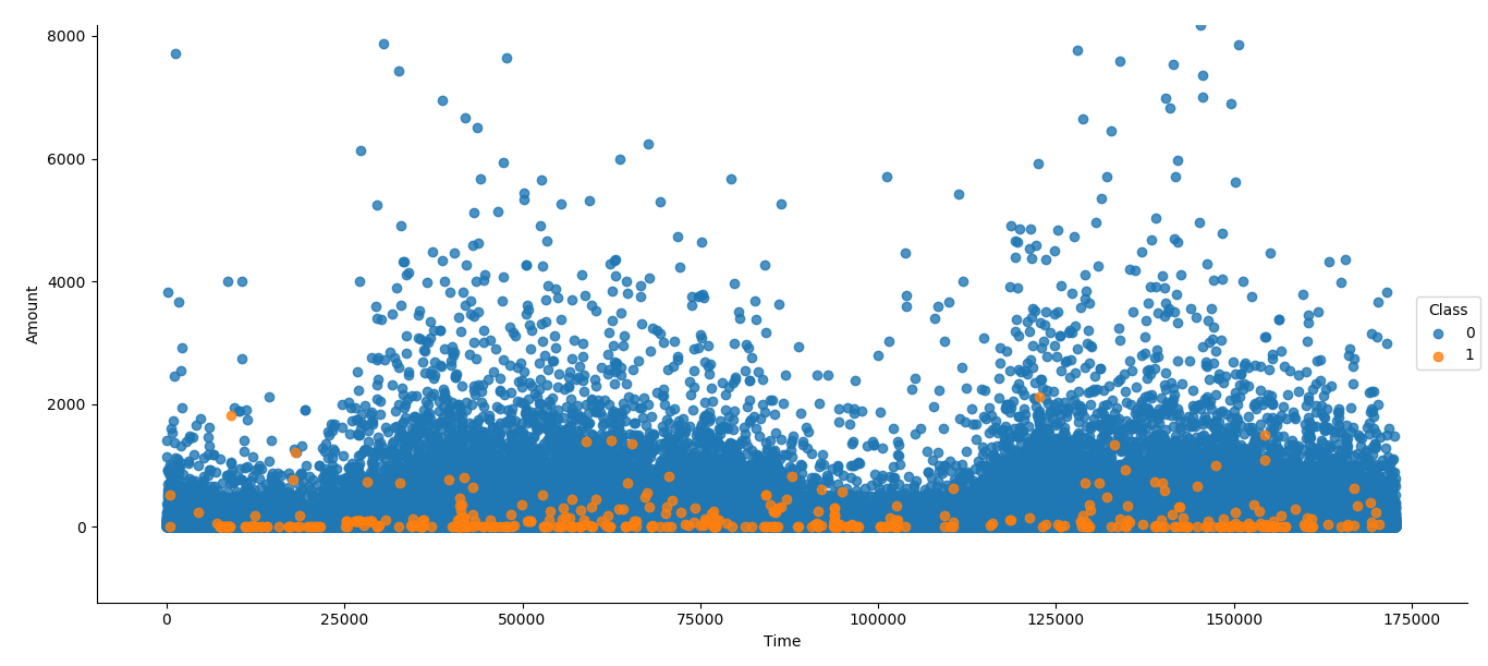
    import seaborn as sns sns.lmplot('Time', 'Amount', dataset, hue='Class', fit_reg=False) fig = plt.gcf() fig.set_size_inches(15, 10) plt.show() 

    where Time and Amount are the two features I needed to plot. Class is the column of the dataset that has the dependent binary class value. Scatter Plot And this is the plot I got as required.

    $\endgroup$
    0
      0
      $\begingroup$

      Let's assume that the name of your dependent variable column is "target", and you have stored the data in "dataset" variable. You can segregate the dataset based on value of target in following way:

      import numpy as np idx_1 = np.where(dataset.target == 1) idx_0 = np.where(dataset.target == 0) 

      The above code with return indices of dataset with target values 0 and 1.

      Now, to display the data, use:

      plt.scatter(dataset.iloc[idx_1].x, dataset.iloc[idx_1].y, s=10, c='b', marker="o", label='first') plt.scatter(dataset.iloc[idx_0].x, dataset.iloc[idx_0].y, s=10, c='r', marker="o", label='second') plt.ylabel('y') plt.xlabel('x') plt.show() 
      $\endgroup$

        Start asking to get answers

        Find the answer to your question by asking.

        Ask question

        Explore related questions

        See similar questions with these tags.