- Notifications
You must be signed in to change notification settings - Fork 22.7k
/
Copy pathindex.md
590 lines (489 loc) · 17.3 KB
/
index.md
1
2
3
4
5
6
7
8
9
10
11
12
13
14
15
16
17
18
19
20
21
22
23
24
25
26
27
28
29
30
31
32
33
34
35
36
37
38
39
40
41
42
43
44
45
46
47
48
49
50
51
52
53
54
55
56
57
58
59
60
61
62
63
64
65
66
67
68
69
70
71
72
73
74
75
76
77
78
79
80
81
82
83
84
85
86
87
88
89
90
91
92
93
94
95
96
97
98
99
100
101
102
103
104
105
106
107
108
109
110
111
112
113
114
115
116
117
118
119
120
121
122
123
124
125
126
127
128
129
130
131
132
133
134
135
136
137
138
139
140
141
142
143
144
145
146
147
148
149
150
151
152
153
154
155
156
157
158
159
160
161
162
163
164
165
166
167
168
169
170
171
172
173
174
175
176
177
178
179
180
181
182
183
184
185
186
187
188
189
190
191
192
193
194
195
196
197
198
199
200
201
202
203
204
205
206
207
208
209
210
211
212
213
214
215
216
217
218
219
220
221
222
223
224
225
226
227
228
229
230
231
232
233
234
235
236
237
238
239
240
241
242
243
244
245
246
247
248
249
250
251
252
253
254
255
256
257
258
259
260
261
262
263
264
265
266
267
268
269
270
271
272
273
274
275
276
277
278
279
280
281
282
283
284
285
286
287
288
289
290
291
292
293
294
295
296
297
298
299
300
301
302
303
304
305
306
307
308
309
310
311
312
313
314
315
316
317
318
319
320
321
322
323
324
325
326
327
328
329
330
331
332
333
334
335
336
337
338
339
340
341
342
343
344
345
346
347
348
349
350
351
352
353
354
355
356
357
358
359
360
361
362
363
364
365
366
367
368
369
370
371
372
373
374
375
376
377
378
379
380
381
382
383
384
385
386
387
388
389
390
391
392
393
394
395
396
397
398
399
400
401
402
403
404
405
406
407
408
409
410
411
412
413
414
415
416
417
418
419
420
421
422
423
424
425
426
427
428
429
430
431
432
433
434
435
436
437
438
439
440
441
442
443
444
445
446
447
448
449
450
451
452
453
454
455
456
457
458
459
460
461
462
463
464
465
466
467
468
469
470
471
472
473
474
475
476
477
478
479
480
481
482
483
484
485
486
487
488
489
490
491
492
493
494
495
496
497
498
499
500
501
502
503
504
505
506
507
508
509
510
511
512
513
514
515
516
517
518
519
520
521
522
523
524
525
526
527
528
529
530
531
532
533
534
535
536
537
538
539
540
541
542
543
544
545
546
547
548
549
550
551
552
553
554
555
556
557
558
559
560
561
562
563
564
565
566
567
568
569
570
571
572
573
574
575
576
577
578
579
580
581
582
583
584
585
586
587
588
589
590
---
title: animation-timing-function
slug: Web/CSS/animation-timing-function
page-type: css-property
browser-compat: css.properties.animation-timing-function
---
{{CSSRef}}
The **`animation-timing-function`**[CSS](/en-US/docs/Web/CSS) property sets how an animation progresses through the duration of each cycle.
{{InteractiveExample("CSS Demo: animation-timing-function")}}
```css interactive-example-choice
animation-timing-function: linear;
```
```css interactive-example-choice
animation-timing-function: ease-in-out;
```
```css interactive-example-choice
animation-timing-function: steps(5, end);
```
```css interactive-example-choice
animation-timing-function: cubic-bezier(0.1, -0.6, 0.2, 0);
```
```html interactive-example
<sectionclass="flex-column"id="default-example">
<divclass="animating"id="example-element"></div>
<buttonid="play-pause">Play</button>
</section>
```
```css interactive-example
#example-element {
animation-duration: 3s;
animation-iteration-count: infinite;
animation-name: slide;
animation-play-state: paused;
background-color: #1766aa;
border-radius: 50%;
border: 5pxsolid#333;
color: white;
height: 150px;
margin: auto;
margin-left: 0;
width: 150px;
}
#example-element.running {
animation-play-state: running;
}
#play-pause {
font-size: 2rem;
}
@keyframesslide {
from {
background-color: orange;
color: black;
margin-left: 0;
}
to {
background-color: orange;
color: black;
margin-left: 80%;
}
}
```
```js interactive-example
"use strict";
window.addEventListener("load", () => {
constel=document.getElementById("example-element");
constbutton=document.getElementById("play-pause");
button.addEventListener("click", () => {
if (el.classList.contains("running")) {
el.classList.remove("running");
button.textContent="Play";
} else {
el.classList.add("running");
button.textContent="Pause";
}
});
});
```
It is often convenient to use the shorthand property {{cssxref("animation")}} to set all animation properties at once.
## Syntax
```css
/* Keyword values */
animation-timing-function: ease;
animation-timing-function: ease-in;
animation-timing-function: ease-out;
animation-timing-function: ease-in-out;
animation-timing-function: linear;
animation-timing-function: step-start;
animation-timing-function: step-end;
/* cubic-bezier() function values */
animation-timing-function: cubic-bezier(0.42, 0, 1, 1); /* ease-in */
animation-timing-function: cubic-bezier(0, 0, 0.58, 1); /* ease-out */
animation-timing-function: cubic-bezier(0.42, 0, 0.58, 1); /* ease-in-out */
/* linear() function values */
animation-timing-function: linear(0, 0.25, 1);
animation-timing-function: linear(0 0%, 0.25 50%, 1 100%);
animation-timing-function: linear(0, 0.25 50% 75%, 1);
animation-timing-function: linear(0, 0.25 50%, 0.25 75%, 1);
/* steps() function values */
animation-timing-function: steps(4, jump-start);
animation-timing-function: steps(10, jump-end);
animation-timing-function: steps(20, jump-none);
animation-timing-function: steps(5, jump-both);
animation-timing-function: steps(6, start);
animation-timing-function: steps(8, end);
/* Multiple animations */
animation-timing-function: ease, step-start, cubic-bezier(0.1, 0.7, 1, 0.1);
/* Global values */
animation-timing-function: inherit;
animation-timing-function: initial;
animation-timing-function: revert;
animation-timing-function: revert-layer;
animation-timing-function: unset;
```
### Values
- {{cssxref("<easing-function>")}}
- : The easing function that corresponds to a given animation, as determined by {{cssxref("animation-name")}}.
The non-step keyword values (`ease`, `linear`, `ease-in-out`, etc.) each represent cubic Bézier curves with fixed four-point values, while the `cubic-bezier()` function value allows non-predefined values to be specified. The `steps()` easing function divides the inputtime into a specified number of equal-length intervals. Its parameters include a number of steps and a step position.
- `linear`
- : Equal to `cubic-bezier(0.0, 0.0, 1.0, 1.0)`, animates at an even speed.
- `ease`
- : Equal to `cubic-bezier(0.25, 0.1, 0.25, 1.0)`, the default value, increases in velocity towards the middle of the animation, slowing back down at the end.
- `ease-in`
- : Equal to `cubic-bezier(0.42, 0, 1.0, 1.0)`, starts off slowly, with the speed of the transition of the animating property increasing until complete.
- `ease-out`
- : Equal to `cubic-bezier(0, 0, 0.58, 1.0)`, starts quickly, slowing down the animation continues.
- `ease-in-out`
- : Equal to `cubic-bezier(0.42, 0, 0.58, 1.0)`, with the animating properties slowly transitioning, speeding up, and then slowing down again.
- `cubic-bezier(<number [0,1]> , <number> , <number [0,1]> , <number>)`
- : An author defined cubic-bezier curve, where the first and third values must be in the range of 0 to 1.
- `linear(<number> <percentage>{1,2}, …)`
- : The function interpolates linearly between the provided easing stop points. Astop point is a pair of an outputprogress and an input percentage. The input percentage is optional and is inferred if not specified. If an input percentage is not provided then the first and last stop points are set to `0%` and `100%` respectively, and the stop points in the middle receive percentage values derived by linearly interpolating between the closest previous and next points that have a percentage value.
- `steps(<integer>, <step-position>)`
- : Displays an animation iteration along _n_ stops along the transition, displaying each stop for equal lengths of time. For example, if _n_ is 5, there are 5 steps. Whether the animation holds temporarily at 0%, 20%, 40%, 60% and 80%, on the 20%, 40%, 60%, 80% and 100%, or makes 5 stops between the 0% and 100% along the animation, or makes 5 stops including the 0% and 100% marks (on the 0%, 25%, 50%, 75%, and 100%) depends on which of the following step position is used:
- `jump-start`
- : Denotes aleft-continuous function, so that the first jump happens when the animation begins.
- `jump-end`
- : Denotes aright-continuous function, so that the last jump happens when the animation ends. This is the default.
- `jump-none`
- : There is no jump on either end, effectively removing a step during the interpolation iteration. Instead, it holds at both the 0% mark and the 100% mark, each for 1/n of the duration.
- `jump-both`
- : Includes pauses at both the 0% and 100% marks, effectively adding a step during the animation iteration.
- `start`
- : Same as `jump-start`.
- `end`
- : Same as `jump-end`.
- `step-start`
- : Equal to `steps(1, jump-start)`
- `step-end`
- : Equal to `steps(1, jump-end)`
> [!NOTE]
> When you specify multiple comma-separated values on an `animation-*` property, they are applied to the animations in the order in which the {{cssxref("animation-name")}}s appear. For situations where the number of animations and `animation-*` property values do not match, see [Setting multiple animation property values](/en-US/docs/Web/CSS/CSS_animations/Using_CSS_animations#setting_multiple_animation_property_values).
>**Note:** `animation-timing-function` has the same effect when creating [CSS scroll-driven animations](/en-US/docs/Web/CSS/CSS_scroll-driven_animations) as it does for regular time-based animations.
## Description
Easing functions may be specified on individual keyframes in a {{cssxref("@keyframes")}} rule. If no **`animation-timing-function`** is specified on a keyframe, the corresponding value of **`animation-timing-function`** from the element to which the animation is applied is used for that keyframe.
Within a keyframe, `animation-timing-function` is an at-rule-specific descriptor, not the property of the same name. The timing is not being animated. Rather, a keyframe's easing function is applied on aproperty-by-property basis from the keyframe on which it is specified until the next keyframe specifying that property, or until the end of the animation if there is no subsequent keyframe specifying that property. As a result, an **`animation-timing-function`** specified on the **`100%`** or **`to`** keyframe will never be used.
## Formal definition
{{cssinfo}}
## Formal syntax
{{csssyntax}}
## Examples
All the examples in this sectionanimate the `width` and `background-color` properties of several `<div>` elements with different `animation-timing-function` values. The width is being animated from `0` to `100%`, and the background color is being animated from lime to magenta.
### Linear function examples
The example demonstrates the effects of various `linear()` easing function values.
```html hidden
<div class="parent">
<div class="linear">'linear' value</div>
<div class="linear-fn1">linear(0, 0.5 50%, 1)</div>
<div class="linear-fn2">linear(0, 0.25 75%, 1)</div>
<div class="linear-fn3">linear(0, 0.75 25%, 1)</div>
<div class="linear-fn4">linear(0, 0.5 25% 75%, 1)</div>
<div class="linear-fn5">linear(0, 0.25 45%, 0.75 55%, 0.5 70%, 1)</div>
<div class="linear-fn6">linear(0, 1.2 50%, 0.75 80%, 1)</div>
<div class="linear-fn7">linear(0, 0.5 75%, 1 120%)</div>
</div>
<div class="x-axis"><span>25%</span><span>50%</span><span>75%</span></div>
<button>Play animation</button>
```
```js hidden
const btn = document.querySelector("button");
const divs = document.querySelectorAll(".parent>div[class]");
btn.addEventListener("click", () => {
btn.setAttribute("disabled", "true");
for (constdivofdivs) {
div.classList.remove("animate");
voiddiv.offsetWidth;
div.classList.add("animate");
}
setTimeout(() => {
btn.removeAttribute("disabled");
}, 11000);
});
```
```css hidden
.x-axis {
display: flex;
justify-content: space-evenly;
width: 80vw;
margin-left: 4px;
}
.parent {
background: linear-gradient(
toright,
white24.8%,
grey24.8%,
grey25.2%,
white25.2%,
white49.8%,
grey49.8%,
grey50.2%,
white50.2%,
white74.8%,
grey74.8%,
grey75.2%,
white75.2%
);
width: 80vw;
font-family: monospace;
font-weight: bold;
border: 2pxsolidgrey;
}
.animate {
animation-name: changeme;
}
.parent>div[class] {
animation-fill-mode: forwards;
animation-duration: 10s;
width: 0;
margin-bottom: 4px;
padding: 5px0;
box-sizing: border-box;
text-wrap: nowrap;
background-color: lime;
}
@keyframeschangeme {
0% {
width: 0em;
}
100% {
width: 100%;
background-color: orange;
}
}
.linear {
animation-timing-function: linear;
}
.linear-fn1 {
animation-timing-function: linear(0, 0.550%, 1);
}
.linear-fn2 {
animation-timing-function: linear(0, 0.2575%, 1);
}
.linear-fn3 {
animation-timing-function: linear(0, 0.7525%, 1);
}
.linear-fn4 {
animation-timing-function: linear(0, 0.525%75%, 1);
}
.linear-fn5 {
animation-timing-function: linear(0, 0.2545%, 0.7555%, 0.570%, 1);
}
.linear-fn6 {
animation-timing-function: linear(0, 1.250%, 0.7580%, 1);
}
.linear-fn7 {
animation-timing-function: linear(0, 0.575%, 1120%);
}
```
{{EmbedLiveSample("Linear function examples", 600, 300)}}
The following image shows graphs of all the `linear()` function values used in this example. Input progress (time) is plotted on the x-axis and output progress is plotted on the y-axis. As per the syntax, the input progress ranges from 0 to 100%, and the output ranges from 0 to 1.
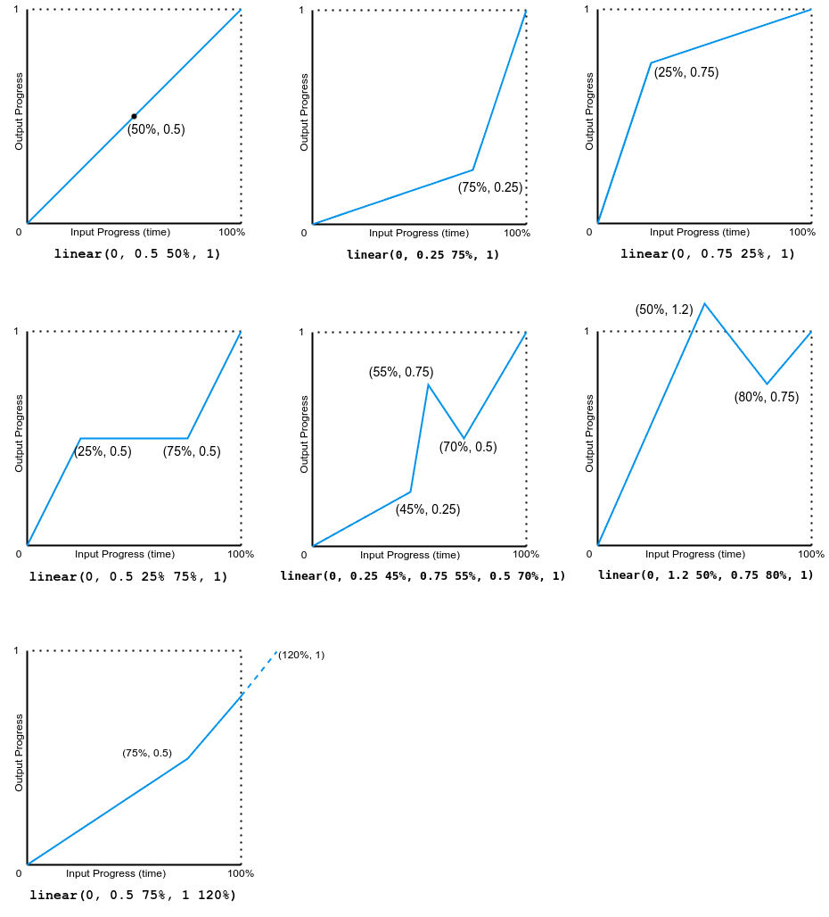
Note that the output can go forward or backward.
### Cubic-Bézier examples
The example demonstrates the effects of various bézier curve easing functions.
```html hidden
<divclass="parent">
<divclass="linear">linear</div>
<divclass="ease">ease</div>
<divclass="ease-in">ease-in</div>
<divclass="ease-out">ease-out</div>
<divclass="ease-in-out">ease-in-out</div>
<divclass="cb">cubic-bezier(.5, -0.5, 1, 1.5)</div>
</div>
<divclass="x-axis"><span>50%</span></div>
<button>Play animation</button>
```
```js hidden
constbtn=document.querySelector("button");
constdivs=document.querySelectorAll(".parent > div[class]");
btn.addEventListener("click", () => {
btn.setAttribute("disabled", "true");
for (constdivof divs) {
div.classList.remove("animate");
voiddiv.offsetWidth;
div.classList.add("animate");
}
setTimeout(() => {
btn.removeAttribute("disabled");
}, 11000);
});
```
```css hidden
.x-axis {
display: flex;
justify-content: space-evenly;
width: 80vw;
margin-left: 4px;
}
.parent {
background: linear-gradient(
toright,
white49.8%,
grey49.8%,
grey50.2%,
white50.2%
);
width: 80vw;
font-family: monospace;
font-weight: bold;
border: 2pxsolidgrey;
}
.animate {
animation-name: changeme;
}
.parent>div[class] {
animation-fill-mode: forwards;
animation-duration: 10s;
width: 0;
margin-bottom: 4px;
padding: 5px0;
box-sizing: border-box;
text-wrap: nowrap;
background-color: lime;
}
@keyframeschangeme {
0% {
width: 0em;
}
100% {
width: 100%;
background-color: orange;
}
}
.linear {
animation-timing-function: linear;
}
.ease {
animation-timing-function: ease;
}
.ease-in {
animation-timing-function: ease-in;
}
.ease-out {
animation-timing-function: ease-out;
}
.ease-in-out {
animation-timing-function: ease-in-out;
}
.cb {
animation-timing-function: cubic-bezier(0.5, -0.5, 1, 1.5);
}
```
{{EmbedLiveSample("Cubic-Bezier_examples", 600, 250)}}
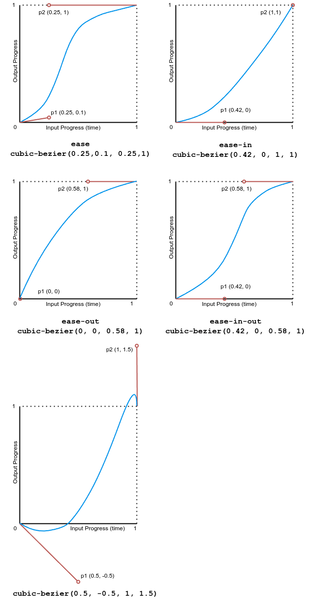
The following image shows graphs of all the cubic bézier function values used in this example. The input progress (time) ranges from 0 to 1 and the output progress ranges from 0 to 1.
### Step examples
This example demonstrates the effects of several step easing function values.
```html hidden
<divclass="parent">
<divclass="linear">linear</div>
<divclass="start">steps(4, start)</div>
<divclass="jump-start">steps(4, jump-start)</div>
<divclass="end">steps(4, end)</div>
<divclass="jump-end">steps(4, jump-end)</div>
<divclass="jump-both">steps(4, jump-both)</div>
<divclass="jump-none">steps(4, jump-none)</div>
<divclass="step-start">step-start</div>
<divclass="step-end">step-end</div>
</div>
<divclass="x-axis"><span>25%</span><span>50%</span><span>75%</span></div>
<button>Play animation</button>
```
```js hidden
constbtn=document.querySelector("button");
constdivs=document.querySelectorAll(".parent > div[class]");
btn.addEventListener("click", () => {
btn.setAttribute("disabled", "true");
for (constdivof divs) {
div.classList.remove("animate");
voiddiv.offsetWidth;
div.classList.add("animate");
}
setTimeout(() => {
btn.removeAttribute("disabled");
}, 11000);
});
```
```css hidden
.x-axis {
display: flex;
justify-content: space-evenly;
width: 80vw;
margin-left: 4px;
}
.parent {
background: linear-gradient(
toright,
white24.8%,
grey24.8%,
grey25.2%,
white25.2%,
white49.8%,
grey49.8%,
grey50.2%,
white50.2%,
white74.8%,
grey74.8%,
grey75.2%,
white75.2%
);
width: 80vw;
font-family: monospace;
font-weight: bold;
border: 2pxsolidgrey;
}
.animate {
animation-name: changeme;
}
.parent>div[class] {
animation-fill-mode: forwards;
animation-duration: 10s;
width: 0;
margin-bottom: 4px;
padding: 5px0;
box-sizing: border-box;
text-wrap: nowrap;
background-color: lime;
}
@keyframeschangeme {
0% {
width: 0em;
}
100% {
width: 100%;
background-color: orange;
}
}
```
```css hidden
.linear {
animation-timing-function: linear;
}
.start {
animation-timing-function: steps(4, start);
}
.jump-start {
animation-timing-function: steps(4, jump-start);
}
.end {
animation-timing-function: steps(4, end);
}
.jump-end {
animation-timing-function: steps(4, jump-end);
}
.jump-both {
animation-timing-function: steps(4, jump-both);
}
.jump-none {
animation-timing-function: steps(4, jump-none);
}
.step-start {
animation-timing-function: step-start;
}
.step-end {
animation-timing-function: step-end;
}
```
{{EmbedLiveSample("Step_examples", 600, 350)}}
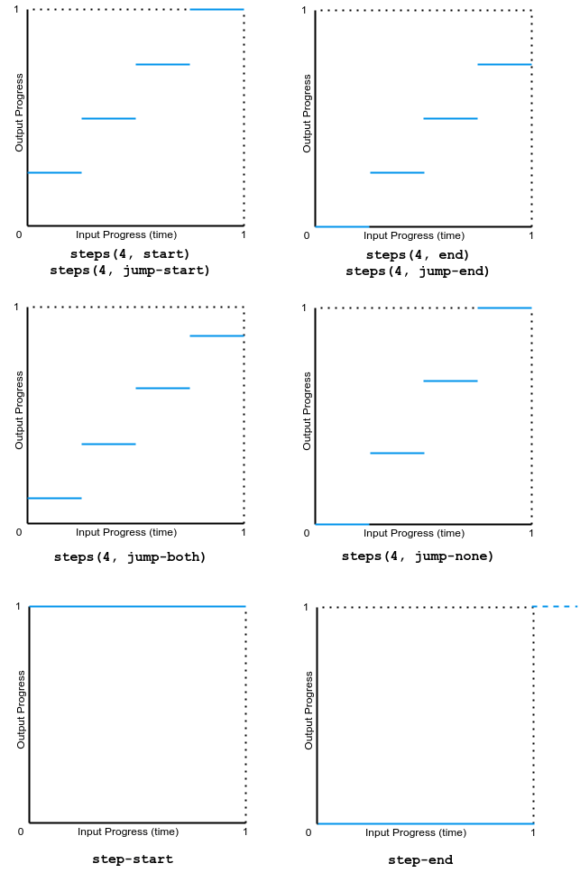
The following image shows graphs of all the `step()` function values used in this example. The input progress (time) and output progress range from 0 to 1.
## Specifications
{{Specifications}}
## Browser compatibility
{{Compat}}
## See also
-[Using CSS animations](/en-US/docs/Web/CSS/CSS_animations/Using_CSS_animations)
- {{cssxref('easing-function')}}
- JavaScript {{domxref("AnimationEvent")}} API
-[Cubic bézier generation tool](https://cubic-bezier.com/)
- Other related animation properties: {{cssxref("animation")}}, {{cssxref("animation-composition")}}, {{cssxref("animation-delay")}}, {{cssxref("animation-direction")}}, {{cssxref("animation-duration")}}, {{cssxref("animation-fill-mode")}}, {{cssxref("animation-iteration-count")}}, {{cssxref("animation-name")}}, {{cssxref("animation-play-state")}}, {{cssxref("animation-timeline")}}