
ButtonBar Control using .NET
4.95/5 (36 votes)
Themed ButtonBar control supporting custom draw with full Designer support
- Download library - 48.25 KB
- Download demo - 58.93 KB
- Download help - 539.71 KB
- Download source - 105.73 KB

Introduction
Buttonbar control provides:
- Keyboard Support
- Full Designer Support
- Custom Drawing Support
Features
ButtonBar control has the following features:
- 6 pre-defined Themes
- Supports alpha blend image
- Full Keyboard support
- Full Design Time support
- Supports Saving/Loading of layout colors
- Supports Disabled back color
- Supports HotKeys
Using the Code
This control is an array of buttons aligned vertical.
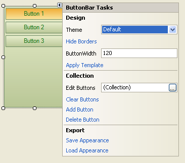
Use the designer to fine tune the appearance.

Keyboard
- Enter Key - Select button. Move by arrow key or hover over a button to select and press enter.
- Down Key - Move to next button.
- Up Key - Move to previous button.
Points of Interest
ButtonBar
Properties
Appearance-Appearanceobject containing Global Appearance information.ButtonWidth- Width of buttons. Control resizes itself to button.DisableTransparency- Gets or Sets Disabled State Transparency.ImageTransparency- Gets or Sets Background Image transparency.Items- Collections of buttons.Padding- Gets or sets distance of button from control boundary.SelectedItem- Gets current selected button.ShowBorders- Gets or Sets whether borders will be shown or not.Spacing- Gets or Sets distance between buttons.ThemeProperty- Property used to Get or Set which theme should be used. See alsoThemeProperty.UseMnemonic- Indicates whether to use shortcut keys or not.
Events
BarClick- Occurs when Bar is clicked. This fired when clicked on area other than buttons.CustomDrawBackGround- Occurs whenButtonBarrequests drawing. This can be used to implement custom draw.CustomDrawItems- Occurs whenBarItemrequests drawing. This can be used to implement own drawing.ItemClick- Occurs when a button is pressed. This is also fired when Shortcut key is pressed or Enter key is pressed.ItemsChanged- Occurs whenBarItemofItemsis changed.ItemsChanging- Occurs whenBarItemofItemsis changing.ItemsClearing- Occurs whenItemsis clearing.ItemsInserted- Occurs whenBarItemofItemsis inserted into collection.ItemsInserting- Occurs whenBarItemis being inserted onItems.ItemsRemoved- Occurs whenBarItemof Items is removed from collection.ItemsRemoving- Occurs whenBarItemis being removed from Items.SelectionChanged- Occurs when Button Selection changes.SelectionChanging- Occurs when Button Selection is about to change.
Methods
HitTestInfo HitTest(Point pt)- PerformsHitTestfor specifiedpoint.of hit. ReturnsptPointHitTestInfoobject containing information related to hit. e.g. Location, button index, etc.HitTestInfo HitTest(int x, int y)- PerformsHitTestfor specifiedpoint.xandycoordinate ofPointof hit. ReturnsHitTestInfoobject containing information related to hit. e.g. Location, button index, etc.bool ExportAppearance(string fileName)- Saves current color scheme of the Calendar control to an XML file.fileNameis path of XML file to which data will be written. Returns whether save was successful or not.bool ImportAppearance(string fileName)- Loads the color scheme from an XML file.fileNameis location of XML file containing color scheme. Returns whether Load was successful or not.EnsureVisibility(int index)- Ensures given item is visible. Scrolls to item if not visible.indexis index of item which needs to be shown.State GetButtonState(BarItem barItem)- Gets Current State of button.BarItemof which state is to be determined.Stateof button.bool SelectItem(BarItem item)- Reset the appearance of Calendar control to default value.Itemto be selected. Returns whether item was selected or not.
ThemeProperty
Properties
UseTheme- Gets or Sets whether to use predefined theme or custom colors.ColorScheme- Gets or SetsColorSchemeto be applied. Please note: This will not be applicable whenUseThemeis set asfalse.
Events
ThemeChanged- Fired whenUseThemeorColorSchemeis changed.
Methods
bool DefaultChanged()- Returns whetherThemePropertyproperties has changed or not.void Reset()- Resets current object to use default value for each property.
Appearance
Properties
Bar- Gets appearance ofButtonBar.IsEmpty- Indicates Appearance is Empty or not.Item- Gets appearance ofBarItem.
Events
AppearanceChanged- Occurs when properties related to drawing have been modified.
Methods
Assign(Appearance appearance)- Assigns properties ofappearanceto current object.bool DefaultChanged()- Returns whether property values have changed or not.Reset()- Resets current appearance to default appearance.
AppearanceBar
Properties
AppearanceBorder- Gets border appearance ofButtonBar.BackStyle- Gets background style ofButtonBar.CornerRadius- Gets corner radius ofButtonBarDisabledMask- Gets or Sets disabled mask color ofButtonBar.FocusedBorder- Gets or Sets focused border color ofButtonBar.IsEmpty- Indicates current object is Empty or not.NormalBorder- Gets or Sets Normal border color ofButtonBar.
Events
AppearanceChanged- Occurs when properties related to drawing have been modified.
Methods
Assign(AppearanceBar app)- Assigns Values of suppliedAppearanceBarto currentobject.app AppearanceBarobject whose value is to be assigned.bool DefaultChanged()- Returns wetherThemePropertyproperties has changed or not.Reset()- Resets current appearance to default appearance.
AppearanceItem
Properties
AppearenceText- GetsAppearenceTextof the item.BackStyle- Gets Back style of Item in Normal state.ClickStyle- Gets Back style of Item in Pressed state.DisabledBorder- Gets or Sets border color of Item in Disabled state.DisabledForeGround- Gets or Sets text color of Item in Disabled state.DisabledStyle- Gets Back style of Item in Disabled state.Gradient- Gets or Sets Gradient of ItemBackColor. This will updateGradientfor all States.HoverBorder- Gets or Sets border color of Item in Hover state.HoverForeGround- Gets or Sets text color of Item in Hover state.HoverStyle- Gets Back style of Item in Hover state.IsEmpty- Indicates current object is Empty or not.NormalBorder- Gets or Sets border color of Item in Normal state.NormalForeGround- Gets or Sets text color of Item in Normal state.SelectedBorder- Gets or Sets border color of Item in Selected state.SelectedForeGround- Gets or Sets text color of Item in Selected state.SelectedHoverStyle- Gets Back style of Item inSelectedHoverstate.SelectedStyle- Gets Back style of Item in Selected state.
Events
AppearanceChanged- Occurs when properties related to drawing have been modified.
Methods
Assign(AppearanceItem app)- Assigns properties ofappto current object.bool DefaultChanged()- Returns whetherThemePropertyproperties has changed or not.Reset()- Resets current appearance to default appearance.
Known Issues
- Some Event handlers do not get created with proper signature by designer. They need to be fixed manually.
History
- 2 December 2009: Initial draft of the control